Wednesday, August 26, 2015

I've been cheating on my weaving

I confess.  Sometimes I crave the thrill of straying outside the bounds of my faithful relationship with my looms.  The temptation to take a risk, try something new and see if I can get away with it, becomes more than I can bear.  So I stray. Yes, I've had the occasional little fling with crochet, but now I've embarked on a full-blown affair that will go on for months, if not years.

Readers of this blog may recall how bowled over I was by the gorgeous Iznik tiles covering the walls of Topkapi Palace in Istanbul.  Since then I have been reading up on them (check out Iznik: The Artistry of Ottoman Ceramics by Walter Denny if you want to see mouth-watering pictures and an exhaustive history of the art form)We also purchased a small but gorgeous Turkish rug, which we keep on our bedroom floor, where it is off-limits to the dog, who has a habit of chewing rug fringe.


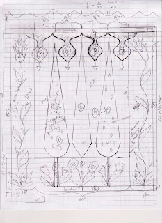
 Alas, the quilt currently on the bed clashes horribly with the rug, so a new quilt is in order, obviously.  Every time I swear I'm done making quilts, I find an excuse reason to make a new one.  So I've been fiddling around with a design inspired by one of the tile panels at Topkapi:


Here is the sketch:


and here is a cleaned up version that I colored in.


 I am just starting to scale up the elements in the sketch to full size and make paper templates to use as patterns for the motifs.  Here's a photo of the templates for tree shapes and the top border, cut out full size from newsprint:


No doubt the design will continue to evolve as I work.  This will be an applique quilt, in which all the trees, flowers, stems and leaves will be cut-out shapes of fabric whose edges are turned under and sewn with tiny hemstitches--appliqued--to the white background.  I've also been researching ways of doing applique since my last applique quilt was made 20 years ago.  It's another excuse to buy books and troll the World Wide Web!  I've discovered that everyone has a different idea of the "best" way to turn under those edges smoothly and neatly and keep them turned under while you stitch them in place.  I've already tried fusing the shapes to the background and machine stitching the raw edges and found that more frustrating than fun.  See below the pillow project I have abandoned.  Machine stitching those tiny pieces and sharp corners requires way more patience and dexterity at the sewing machine than I have.  And hand-stitching through fused fabric is not my idea of fun either.  (This pattern is from Constantinople Quilts, by Tamsin Harvey.)


I haven't yet designed all the templates for the flowers and leaves in the quilt, but I need to take a quick detour from the drawing board first.  I need to find out how small and fiddly I can make my shapes and still manage to stitch them together without losing my mind.  Time to make some samples.  Then back to the drawing board. . . .As I remind my students, the design process is more of a spiral than a straight line.

My fantasy is to have handwork I can curl up on the couch with, a project whose pieces I can pin (or glue-stick??) together in advance and mindlessly stitch up in the evening.  Stay tuned for whether this "affair" lives up to the fantasy!

Wednesday, August 19, 2015

Fabric Painting 3 Ways

This weekend I get to teach this class, which is always fast-paced, fun and messy.  We'll be using Shiva Paintstiks (chunky oil sticks), Neocolor II watercolor crayons, and Dye-Na-Flow silk paints, making patterns and visual textures on black and white cotton and silk.  We'll use various techniques including spraying water, sprinkling salt, texture rubbings, resists, stencils, stamps, and faux-dyed effects.  This class is designed to give students a taste of how each of these fabric paints behaves and what effects are possible, and students will go home with several good-sized samples of their explorations.  They can choose to keep the samples for reference and inspiration or make them into a project of their choice.

When I first started graduate school in Fibers, my professor looked at my quilts and asked, "Do you ever use non-commercial fabric?"  I had no idea what she was talking about--wasn't all fabric commercial?  Soon I was introduced to the wide world of surface design using dyes, paints and a myriad of other techniques.  If you're a quilter or sewist who doesn't want to limit your choices to what the local fabric store happens to have in stock, this class is for you. 

Here's a peek at what's possible:

Neocolor IIs on cotton, hand and machine stitch

Neocolor IIs on cotton, salt effects and stamps
Shiva Paintstiks on black cotton, using stencils and rubbing plates
I used Shiva Paintstiks to alter commercial fabric in my art quilt, Sam at Glacier
My art quilt, Ways of Looking at Dodd Creek #6, used Dye-Na-Flow silk paint on dishtowel background

My art quilt Cherith Farm includes Dye-na-Flow on linen background and Neocolor IIs on organza (eggs)
Doesn't this look fun?  I'll be offering this class again in the Atlanta area on Saturday, Oct. 3.  Click HERE for more information and scroll to the bottom for the class description. 

Wednesday, August 12, 2015

touchstones

I have long been a collector of quotations.  I love the pithy, authoritative statement that seems to encapsulate some facet of Truth.  I've especially enjoyed collecting bits of wisdom about creativity and the art and design process, and I have gone so far as to compile a two-page handout of quotations about art that I share with my Design classes.  Choosing just a few to share here is like choosing which of your children you like best, but here are two of my favorites:


"What if we treated driving like we treat the arts?  

Image result for sports car image

We’d assume that people were either born to drive or not.  We’d wait and see if, as children, they started driving on their own, if they had talent and a calling.  If they did, we would be careful not to interfere with their talent and possibly suppress it.  We would make sure to encourage only those who seemed they’d be able to drive professionally.  We’d pay some of them millions of dollars to drive and lavish them with fame; others we would refuse to support, encouraging them to do something more useful for society.  Everyone else would assume that they would never be able to drive and would just stand on the sidewalks and watch the traffic."
--Danny Gregory, in his book The Creative License: Giving yourself Permission to be the Artist You Truly Are


"An artist is not a special kind of person—each person is a special kind of artist."
            --Kiki Smith


These quotations get at something I deeply believe--that being creative in the broadest sense is part of our DNA, our birthright as human beings.  Each human being has creative potential and ability.  We are obviously not all creative in the same ways, and even those who are creative in the field of visual arts express their creativity in almost limitless ways.  There is no one right way to be an artist, and you don't have to be born with a certain rare type of talent.  Just imagine what we'd see if we assumed everyone could learn to make art, just as we assume nearly everyone can learn to drive!

So. . . don't just stand on the sidewalk and watch other people drive all the cool, colorful cars!  Think about signing up for a class in whatever kind of creative expression appeals to you.  A friend of mine, an art quilter, recently shared with me some of the drawings she has done as part of her first formal class in drawing.  She is amazed at how well they have turned out, and indeed they are quite good, after just a handful of lessons.   Go ahead--get behind the wheel--you might just amaze yourself!

Wednesday, August 5, 2015

keeping a visual journal

Recent pages from my sketchbook
 As I get ready to teach my Design Kickstarters class in a couple weeks (and there are still spaces if you're interested--learn more HERE) I decided it might be helpful to share with my students this list of guiding principles for how to use a sketchbook or visual journal.  For many folks, just the idea of a notebook full of blank paper can be intimidating.  The whole idea behind the Kickstarters class is to make friends with your sketchbook or visual journal or whatever you want to call it (Bruce, for example).  To make it a tool that works for you.  To accept that in itself it is not a finished work of art, despite what you may see in magazines or on Pinterest.  For me anyway, it's more like a scrapbook and a way for me to think and feel my way forward.  Nothing more, nothing less.  And if you keep these notebooks for long enough, those ragged old books can become a great resource and record of where you've been and where you might go next.


So, here are my "Rules"*:

1.      * There are no rules. It’s your book.  Make it work for you.  It’s OK to include writing.  It’s OK to cut and paste things into it. In fact a lot of what I do is collage rather than straight drawing or sketching.

2.      Don’t buy a fancy book you’re afraid to make a mark in.  Choose one whose size and proportions and overall look you like.  If you think you’ll use paint in it, choose one with heavier paper.  It’s OK for it to be messy.

3.      Remember, it’s a work book, a way for you to think out loud and try things out, not a Deathless Work of Art.  It’s For Your Eyes Only.  It’s a means to an end, not an end in itself.  Don’t judge it.

4.      You can use your visual journal to work out your ideas as much as possible before you start using art materials.  Saves on materials!  Believe me, I've learned this one the hard way. . .

5.      If you draw or sketch, use something bold like ink or thick drawing pencils and just keep drawing, even if you make “mistakes” or don’t like what you see.  Just keep going—don’t get bogged down erasing.  Silence that inner critic!  Try oil pastels, crayons, watercolors . . . .

6.      Get a copy of Drawing on the Right Side of the Brain by Betty Edwards and try some of the exercises in there, especially contour drawing and blind contour drawing.

7.      If drawing terrifies you, try “drawing with scissors.”  Cut (or tear) shapes out of colored paper freehand—without drawing them first—and collage them to make designs.  Then cut a viewfinder (a rectangular window) in a piece of paper and use it to isolate sections that might work well as a composition in themselves.

8.      If a blank white page is intimidating, start by coating the page with a light wash of watercolor, or paste in a piece of patterned paper as a background, or lightly stamp or scribble all over the page . . .anything to break up the white expanse.  You might even try a sketchbook with black paper.

9.      Take a small sketchbook with you on trips, along with some colored pencils or a small watercolor kit.  New surroundings often produce new perceptions.  Taking photos is fine too, but you only really know something once you try to draw it.  On vacation you can usually find time to sketch.

10.  The more you draw, the better you get at it.  

That said,  I find that lately I do a lot more collage in my sketchbook than drawing.  Or a mix of the two. Whatever works.  Recently I had the unusual experience of seeing a sketch translate almost unchanged into an actual piece.  That hardly ever happens!  


Do you keep a sketchbook?  How do you use it?