Showing posts with label art quilts. Show all posts

Wednesday, March 14, 2018

Swedish death cleaning for artists

Have you heard of the concept called "Swedish death cleaning"?  It's not as grim as it sounds.  The idea is that you do your heirs a huge favor by purging and organizing your extraneous stuff before you die, so that they don't have to.  The best-selling book that popularized the concept refers to it as "a gentle art." The promise is that by stripping out the inessential you can live a more stress-free, clutter-free life.

It's especially hard for artists to purge artwork, I think, because of the emotional, aesthetic, and monetary value attached to the art we've accumulated.  The current, April/May issue of American Craft features a helpful article called Planning Your Legacy.  How do you  plan for what happens to your artwork after you're gone?

It's all been on my mind lately as Sam and I purge and pack in preparation for a move across the country.  He's been photographing and I've been working in various fiber media for over twenty years, so we've generated quite a bit of work ourselves.  And then there's the art we have purchased, and the art we've inherited.  It's a lot, far more than we can hang on the walls at any one time.  (We do try to rotate what's on the walls regularly.)  So now we're faced with one tough call after another about which works to move, and which to let go of.

Regarding my own work, I've done a variety of things.  Some pieces have been sold at a discount.


Ways of  Looking at Dodd Creek #7.  Mixed media collage
(c) Molly Elkind 14" x 14"

Ways of Looking at Dodd Creek #11.  Mixed media bead embroidery.
(c) Molly Elkind  14" x 18"

Cardinals.  Quilt (cotton).  (c) Molly Elkind 54" x 70"
Some work I've given away.

Ways of Looking at Dodd Creek #6.  Mixed media fabric collage.
(c) Molly Elkind 14" x 14" 

Some work I've dismantled, taken out of its frames and shadowboxes, and saved in a smaller, lighter format for future reference or as potential raw material for future work.

Streambed:  Glacier.  Mixed media embroidery.
(c) Molly Elkind 8.5" x 11"

Gaps in the Sky:  Carolina Parakeet. 
Mixed media collage. 
(c) Molly Elkind 25" x 35" x 4" 

Some pieces that I no longer like, I've discarded.  Thrown out.  Trashed.   Apologies here for some less than stellar photographs of this older work.


Ways of Looking at Dodd Creek #4.  Mixed media fabric collage.
(c) Molly Elkind 12" x 24" 

Basket Case:  Improvisation.  Quilt (cotton). 
(c) Molly Elkind 38.5" x 38.5"

The 9/11 piece below was easy to throw out because it had sat in a cardboard box in the corner of our humid Georgia basement for 15 years, and showed mildew when I took it out.  A cautionary tale!

Into the Whirlwind:  September 2001.  Mixed media fabric collage.
(c) Molly Elkind 84" x 43" x 3"

It may sound shocking but it's surprisingly liberating to throw away work you don't like any more.  I think it frees up psychic space for new work.  Not everything we make is precious.  Some of it was only work we had to do to get ready to make the next piece, or the one after that.

That said, I did keep some older work that I especially like.

Six Sketches #6.  Mixed media embroidery.
 (c) Molly Elkind 14" x 12"
Cathedral.  Handmade paper sculpture.
(c) Molly Elkind 17" x 9.5" x 10" 

I'm really curious what you all have done in this situation.  What are your strategies and criteria for dealing with your work when it piles up, or when you have to down-size?  Let us know in the comments.


Wednesday, August 23, 2017

New Legacies: Contemporary Art Quilts in Fort Collins, CO

Before I fell in love with tapestry weaving, I was obsessed, for years, with making quilts, especially non-traditional art quilts.  I still enjoy checking in with the art quilt world and seeing what's going on. As in tapestry, the main ingredients are thread or yarn, the elements of design (especially shape, line, and color), and of course, time.  I've written before about the similarities in designing quilts and designing tapestries.

Last weekend I had the chance to see one of the longest-lived art quilt shows in the country, the 35th annual New Legacies show of Contemporary Art Quilts at Lincoln Center in Fort Collins, Colorado. All photographs below are scanned from the show catalog (available by contacting the box office HERE). There were many intriguing quilts in this show; below are just a few of my favorites.

I am moved to write about this show because I realized that the art quilts I liked best were those that, as in my favorite tapestries, explore the unique possibilities of their medium in an elegant and economical way.  The artist fully exploits the design potential for enticing textures, interesting shapes and lines, and the emotional impact of stitch.

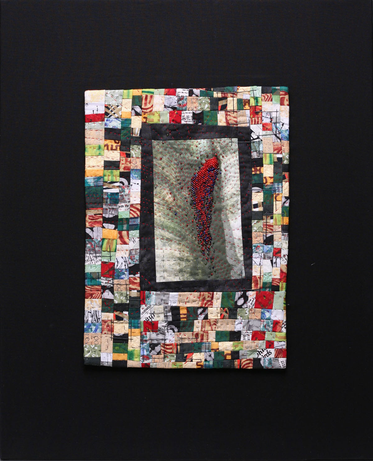
I was excited to see that several artists are really questioning the definition of a quilt.   The show's sole requirement was that fiber pieces have three layers stitched together, which is pretty much the most fundamental definition of a quilt.  The piece below really stretches that definition.  It's hard to see in the photograph, but on each strip there is a base layer, to which thousands of scraps of white and cream colored fabrics of varied textures and shapes are stitched with a meandering quilting line.  The red flower shapes are added atop the white layer, and loose red threads dangle abundantly.  The texture is lush and begs to be touched.  The piece makes a powerful impact, though many might argue that it strays too far from tradition to be called a quilt.

Chiaki Dosho, The Crossing Times 9.  77.5" x 98.5" x 1"
Old Japanese kimono silk, synthetic fiber, wool
As you would expect in an art quilt show, there was plenty of original surface design:  dyeing, dye-painting, free-motion stitching, improvisational cutting and piecing, digital images printed on fabric and the incorporation of found objects.  Very few art quilters are satisfied by simply piecing together commercially printed fabrics.

For a few decades now quilters have been printing digital photographs on fabric and using those fabrics in quilts.  One artist in the show took the straightforward approach of simply quilting lines over her printed images and leaving it at that.  To me the simple addition of quilting lines does not transform the photograph enough to justify making it a quilt.  

I especially liked what Charlotte Ziebarth did with her digitally printed fabric.  She printed her own close-up images of water on fabric, creating an arashi shibori effect, and then cut and pieced the fabrics into new compositions.  The resulting quilts convey the fluidity and shifting colors of water without relying only the literal image.  There are layers of wateriness here.

Charlotte Ziebarth, Wave Equations.  36" x 51"
silk, cotton batting, cotton backing, archival printing inks, rayon and cotton threads, acrylic spray varnish;
digital art printed on treated silk, cut layered, fused, and stitched
One artist took surface design on fabric to its logical conclusion.  I have been waiting for years for a quilter to decide to make a painting on canvas and call it a quilt. . . and it finally happened!

Sherry Kleinman, Raw Edged Beauty 30" x 25"
artist canvas, paints, threads, wool/acrylic felt, water soluble media (paints, crayons pencils, raw edges, hanging threads;
hand piecing, machine and hand stitching
Sherry Kleinman pieced together canvas and then painted on the "wrong" side, where the seam allowances and dangling threads are.  For me this is a conceptual piece that asks the question:  Why is this bit of painted canvas a quilt (i.e., craft object) and not a painting (i.e., fine art)?  The floor is open for responses . . .

detail, Sherry Kleinman, Raw Edged Beauty 
I suppose the raw edges of the canvas and the abundant surface stitching push it over into the craft/quilt category. . . but in a time when many painters are using fiber art techniques, I am not convinced that there are any truly meaningful distinctions between "craft" and "art".  But that's a subject for another day.

In some cases artists pushed the limits of the technique that is for many folks practically synonymous with quilt-making:  piecing.
Denise Roberts, Mitote #11, 85" x 38.5"
cotton; hand-dyed, cut into directly, machine pieced and quilted
The piecing here is mind-bogglingly intricate.  But it's not just a technical tour de force--the artist's handling of value contrast, especially those white highlights, really conveys energy and movement.  I also enjoy the unusual color scheme.


detail, Denise Roberts, Mitote #11
Finally I want to share a piece which seemed to me to perfectly integrate image and fabric. . . much as weavers try to do in tapestry.  Elena Stokes's Infinity VI is made of strips from sari silks, collaged together by fusing and machine quilting.  The strips determine the image.  The stitching, raw edges, loose threads and all, convey emotion with elegance and economy.

Elena Stokes, Infinity VI, 46" x 84".
 reclaimed sari silks from India, cotton batting, fusible web, thread; textile collage, fused and machine quilted
detail, Elena Stokes, Infinity VI

And this brings me back to tapestry.  One thing I love about tapestry is that, in its traditional form, it is elegant and economical.  The interlacing of weft and warp creates the image and the cloth simultaneously.  The description of materials and process is likewise concise:  typically something like "cotton, wool; handwoven tapestry", although of course this can vary widely. 

As someone who has made many quilts and mixed media pieces, I get it.  It's exciting to explore the myriad surface design techniques and materials available today.   But I sigh when I see a long paragraph listing materials and techniques on the wall label, as if the artist wants full credit for every single thing she did to that cloth.  One doesn't need to use every tool in the toolbox all at once.  For me at least, the most impressive work exploits the expressive potential of one or two materials or techniques at a time, rather than layering on a multitude of processes.  Less is more. 

But that's just my opinion.  What do you think?   


Wednesday, July 19, 2017

Margins and borders

Artists, have you ever stepped back and looked at the whole range of your work, and noticed something, a common thread or theme, that you hadn't been aware of before?

Today I'm thinking out loud about a trend I've noticed in my own work.  Lately I've been purging my studio, pulling out old work and deciding what to do with it, and I've noticed a persistent habit or feature in my compositions that I wasn't fully aware of until now.  I seem to have a thing for margins and borders.


(c) Molly Elkind, Freud's Diagnosis, hand embroidery, c. 1995.
cotton.  12" x 12"

I did this embroidery as a surface design class assignment at the University of Louisville.  The dense stitching distorted the cotton ground, so I decided to exploit the mistake by stitching an off-kilter frame around the piece.  I still love the quotation, attributed to Freud:  "Constant needlework is one of the factors that rendered women particularly prone to hysteria because daydreaming over embroidery induced dispositional hypnoid states."  

(c) Molly Elkind, Out of My Hands, hand embroidery, 1998
cotton.  12" x 12"
This embroidery was inspired by Amish quilts.  As I worked I imagined what might result if those masterful quilters could break free of their carefully circumscribed lives and 20-stitches-per-inch standards, stitching irregular shapes that break the confines of the square and disrupt traditional patterns. 

Here's one of my first self-designed quilts.  It may be hard to make out in the photo below, but I chose to quilt the border with an irregular zigzag line, perhaps echoing the off-kilter log cabin frames around each flower, rather than a traditional feather or other curvilinear motif.   

(c) Molly Elkind, Applique Flowers, quilt, hand applique and quilting, machine piecing, 1993.
cotton, 35" x 29"
Here's another early quilt, in which the border comes and goes, like a lost-and-found line in drawing. I borrowed this idea from master quilter Ruth McDowell.

 (c) Molly Elkind, Cardinals, quilt, hand and machine pieced, appliqued and quilted. c. 1995
cotton.  54" x 70" 
Below are two pieces from my Ways of Looking at Dodd Creek series of small mixed media quilt/collages.  In this one I definitely see the wide border around a central image that continues to interest me today.  

(c) Molly Elkind, Ways of Looking at Dodd Creek #5, 2007.
Mixed media, 22" x 18" 

And in this piece, I couldn't resist adding a binding in an unexpected color.

(c) Molly Elkind, Ways of Looking at Dodd Creek #6, 2008.
Mixed media, 14" x 14"
So, what does all this have to do with anything?  I've been working on two series of tapestries for the past few years.  One series, inspired by an icon of the Virgin Mary, I've posted about fairly often, most recently here and here.  (It looks like I might need to do an update on these soon!)

The other series is inspired by the format, composition and colors of medieval illuminated manuscripts.  I love the way these manuscripts combine text and image in a gorgeous whole, a patterned, brilliantly colored, decorative surface that carries meaning. . .meaning that most of us can't decipher anymore.


Hours of Etienne Chevalier,
160 x 115 mm, c. 1420, Visitation,
illuminated by the Master of the Boucicaut Hours
British Library Catalogue of Illuminated Manuscripts

I especially like the way some manuscript pages leave spacious margins around an area of dense text in the center of the page.  Sometimes these margins are filled with decorative patterns, sometimes not.  My tapestry Red Letter Day explored this composition in an abstract way.

(c) Molly Elkind, Red Letter Day, handwoven tapestry, 2016.
cotton, wool, synthetic.  35.5" x 26"

I'm going to continue to play with this theme as I work on more tapestries inspired by centers and margins.  

Hey, all you artists and makers out there!  Have you ever pulled out your work and looked at the whole range of it?  Did you discover anything surprising? 


Thursday, March 30, 2017

SDA's juried show "Shifting Landscapes," part 2


Last week I shared with you a look at the juried members' show of the Surface Design Association (SDA), currently on view at form & concept gallery in Santa Fe through May 20.  Today I'd like to pick up where I left off, with a look at three specific fiber media as represented by works in the show:  weaving, embroidery, and quilting.  Remember that the brief for the show is that the artwork needed to be made of fiber or using fiber techniques, or be inspired by textiles.  (Disclosures:  while I am a member of SDA, I did not enter this show.  And, for better or worse, all photographs are by me.)

As I shared last week, my favorite piece was Red Dirt Rug by Rena Detrixhe:


Red Dirt Rug, Rena Detrixhe.  earth, 96' x 72" x 5"
   
In her statement, the artist wrote:
The refining and sifting of the soil and the imprinting of the pattern is a meditation on this past, a gesture of sensitivity and a desire for understanding.  It is a meticulous and solitary act.  .. . The form of the rug, from a western perspective, is an object of luxury; it is a symbol of authority and power.  For the maker it is an expression of beauty and often cultural significance, the result of many hours of careful labor.  Through this form, I contemplate the tension between nature and human impact while suggesting the ubiquitousness and preciousness of the earth just below our feet. 
This reference to "meticulous and solitary. . . hours of careful labor" helped me to see that this piece, though it contains no fiber and uses no textile techniques at all, belongs in this show as a kind of conceptual weaving.  It's a fresh and thoughtful response to the function, history and traditional patterning of rugs.  It flips the exquisitely crafted luxury item and status symbol on its head.

A more traditional weaving spoke to a very specific place, the Litzmannstadt, or Lodz, ghetto in Poland during World War II.  From this site Jews from all over Europe were deported to concentration camps.  Wendy Weiss based her image on a photograph of a commemorative granite marker.  She effectively uses Jacquard weaving (I believe) to create a piece that evokes imprisonment.  For me the separate strips suggest a kind of fence, as does the diamond patterning. There is no taking comfort in the softness of this material.

Wendy Weiss, Litzmannstadt Getto, 1940-1944, weaving, 53" x 111"

detail, Wendy Weiss, Litzmannstadt Getto, 1940-1944, weaving, 53" x 111"

I liked this piece better the more I looked at it.  Each paper tag or label, all 638 of them, was colored with watercolor and ink.  Its connection to weaving and fiber is tenuous (though paper is technically a fiber), but in this case the grid format, the color, and the implied elements of labor over time made for me an interesting conceptual connection for me with weaving.  The connection to place is perhaps implied by the colors and the horizontal lines; the title suggests this is more of an internal landscape.

Jenna Lynch, Traveling Within, Feeling Through, Dreaming Beyond, The Lines
638 watercolor and ink drawings on paper, 56" x 33"


detail, Jenna Lynch, Traveling Within, Feeling Through, Dreaming Beyond, The Lines
638 watercolor and ink drawings on paper, 56" x 33"

In the field of embroidery, there was one piece that might be called "straight" or traditional.

Mandy Remmen, Blue Mountains, embroidery, 10" x 11.5" x 1.75"
At first glance, a familiar scene of hills under a blue sky, presented in a very traditional gilt frame, seemed almost quaint in the context of other, edgier work in the show.  But closer inspection shows a boldness and freedom to the stitching that belies the fussiness and prettiness of much conventional embroidery.  The frame begins to seem like a ironic comment on the subject and the medium.

detail, Mandy Remmen, Blue Mountains, embroidery, 10" x 11.5" x 1.75"

Quiltmaking is undoubtedly one of the most popular fiber art forms today.  Artists are exploring a myriad of surface design techniques and materials to move quilting far beyond its utilitarian origins. The quilts in this show represented several current trends in the art quilt world:  embellishment, improvisational piecing, and rust-dyeing.  

Melody Money, Sky Prayers, Memories of Sky, mixed-media textile, 59" x 41"
detail, Melody Money, Sky Prayers, Memories of Sky, mixed-media textile, 59" x 41"
The artist does convey a sense of  a magical, sacred Eastern landscape in this piece.  The quilting is exquisite.  While technically impressive, this piece seems a bit overworked and over-embellished to me.

Improvisational piecing and the use of ragged scraps have been popular for a few decades now, thanks to artists like the Gee's Bend quilters, Nancy Crow, and countless others.  Hand-stitching is also making a comeback, and all of this is evident in this piece:

Patricia Kennedy-Zafred, A Dying Breed, fiber, art quilt, 44" x 44"
Regina Benson took an interesting approach to the quilt format, slicing the rectangle into three shards and mounting them as a relief on the wall.

Regina Benson, V Restored Legacy, fiber, 42" x 46" x 3"
detail, Regina Benson, V Restored Legacy, fiber, 42" x 46" x 3"
I wonder if the title is a reference to the old iron tools, perhaps, that had been used to rust-dye the fabric. There is a sense of industrial decay, of a whole that has come apart here (a twist on the pieced quilt that makes a whole from fragments), that could be a comment on the future of our natural world.

If you've made it this far, thank you for reading!  Obviously my opinions are simply my own responses.  You would likely respond differently to this work, and that is as it should be.  Please share your comments below.  Let's engage in the critical conversation our fiber medium needs.


Wednesday, June 8, 2016

designing quilts, designing tapestry

I'm nearly halfway through teaching a series of classes in design at Southeast Fiber Alliance (SEFAA).   As part of my research and preparation I rediscovered this book by one of my favorite art quilt-makers, Ruth McDowell.

You can buy it HERE
As I read I was struck by how similar the process of designing a pieced quilt is to the process of designing tapestry.  I shouldn't have been surprised.  In fact, when I took a workshop with the master tapestry weaver Joan Baxter over a year ago, she reassured me that my background in quilt-making and collage was actually excellent preparation for designing tapestry design.  How hugely encouraging that was to hear!

Both quilts and tapestries rely on shapes that fit together like puzzle pieces. In both mediums, the "background" must be designed and constructed with just as much care as the "foreground;" they are integrated together in the construction process.   In both quilts and tapestry there is often an implied underlying structure, even a grid, that orders or constrains the arrangement of the shapes.  Think of the familiar block structure of a traditional quilt, or the over-under grid of woven tapestry.   Because of the techniques used in constructing a quilt or a tapestry, if the artist is aiming for a pictorial representation, a fair amount of abstraction and simplification needs to happen during the design process.  (Yes, it is possible to make "photo-realistic" quilts and tapestries, but why torture either medium that way?  Why not exploit the design potential inherent in each medium instead?)

One of the strengths of Ruth McDowell's approach is that she acknowledges the potentially tricky aspects of pieced quilts and suggests ways of tweaking the design so as to avoid these technical pitfalls.  Her tweaks actually make for more dynamic and interesting designs, in my opinion.  Below you see how a tulip block might be designed in a traditional quilt, with tricky Y-seams and the need to match points.  The second diagram shows those seams shifted so that the pieces can be sewn together much more easily--and the design is more interesting for its asymmetry and cropping.

from Ruth B. McDowell's Design Worskshop, p. 7.  

This got me thinking of how important it is while designing tapestry to take the medium's strengths and challenges into account.  Smooth, gently sloping curves can be difficult to achieve in tapestry.  You have a few choices about how to deal with this challenge.  You can exaggerate and exploit the steppiness of such curves. . . or you can choose to weave a piece "sideways" to allow for eccentric weaving and gentler, easier curves.  Here's another example:  in a quilt, the size of the tiniest design element is dictated by what can be physically sewn together, and the size of this tiny piece in turn determines the quilt's overall size and scale.  In the same way, in tapestry we follow the "two-warp rule" so that our tiniest shapes are at least two warps wide, for ease of weaving.  Notice the two-warp stripe of gold at the side of Mary's face below.

Molly Elkind, Mary (greater is what she bore in her mind), detail

In both mediums, ultimately the same rules for good design apply:  careful planning of areas of light, medium and dark values.  Sensitive construction of shapes and selection of colors.  Skillful use of contrast, variety, rhythm, scale and texture.  And above all, designing with the unique characteristics of the medium in mind.  That's all!

Want to know more?  There are still some spots available in my remaining Design Modules at SEFAA.  Click HERE and HERE to find out more and to register.

Now, I'm off to see how I can use these insights as I design my next big tapestry. . . .


Friday, February 20, 2015

Looking at the design process

Lately I've been preparing to teaching a class on the design process at the Southeast Fiber Forum conference at Arrowmont School of Arts and Crafts.  I put together a slide show of several of my artworks, along with their inspirations and the samples or models I made while working on each piece.  It was really interesting to look back at my work in this way and to realize that like everyone I return to the same sources of inspiration and ways of working over and over again.

I started as a quiltmaker, and I literally started making art quilts twenty years ago by looking out the window at my own backyard.  We had lots of trees and bird life, and in the snowy Kentucky winters cardinals would practically line up at our bird feeder.  I knew I wanted to capture their vivid red against the snow.  I wanted to design my own original quilt block, one that was recognizably a cardinal and was also sew-able, without too much sobbing and gnashing of teeth.  Here are a few of my early sketches:


You can see these early ideas were all over the place, from semi-realistic to completely abstract, and they were hardly resolved, in some cases quite crude (I'm lookin' at you, triangle bird!)   I find that the hard thing at this stage is to keep faith and remain patient with yourself as the ideas do develop and resolve.

My fibers professor in grad school required that before we plunged into the construction of any piece, we had to make several samples, mock-ups using the actual design and materials, in order to test our ideas, materials, and methods.  Often we had to do half a dozen or more samples before we were permitted to proceed with construction of the final piece.  While this is not a project I did for school, I followed this process. So here are a few of the cardinal blocks I tried:

The last two examples are very close to the actual block I used, a diamond-shaped block that tessellated with background blocks in the same shape.  I decided that despite their drab coloring the female cardinals deserved to be seen too so I included them as well.  Often it's the duller, quieter colors in a piece that allow the brighter colors to really sing.  I added a wing that is a faced flap that stands out from the block, an idea I borrowed from the amazing quilt artist Ruth McDowell.   To add interest some of the background blocks are pieced in strips, and the quilt's border is irregular and interrupted in places by the blocks themselves. 

Here's the final quilt:

 Of course, you know what they say about the best-laid plans.  In this case, after I had all the blocks pieced together and had done the quilting--when the quilt was nearly finished, in other words--I added the large branch shapes, appliqueing them over the surface of the quilt.  It seemed that the birds perched on their tiny twigs needed to be connected to larger branches somehow.  Not all the birds are on a branch, but enough are.  The birds are no longer floating in space, and the branches lead the eye through the piece effectively.  And I like the disconnectedness of the branches, which would never have happened if I had designed them in from the beginning.

So it seems that both deliberate planning and then being able to respond sensitively to the piece in front of you as it develops are both crucial.  Hmmm.  This is one of those lessons I seem to learn anew with almost every piece I do. 

There are still some spots available in my class at Fiber Forum, April 16-19, 2015.  Email me for more information, or go here.